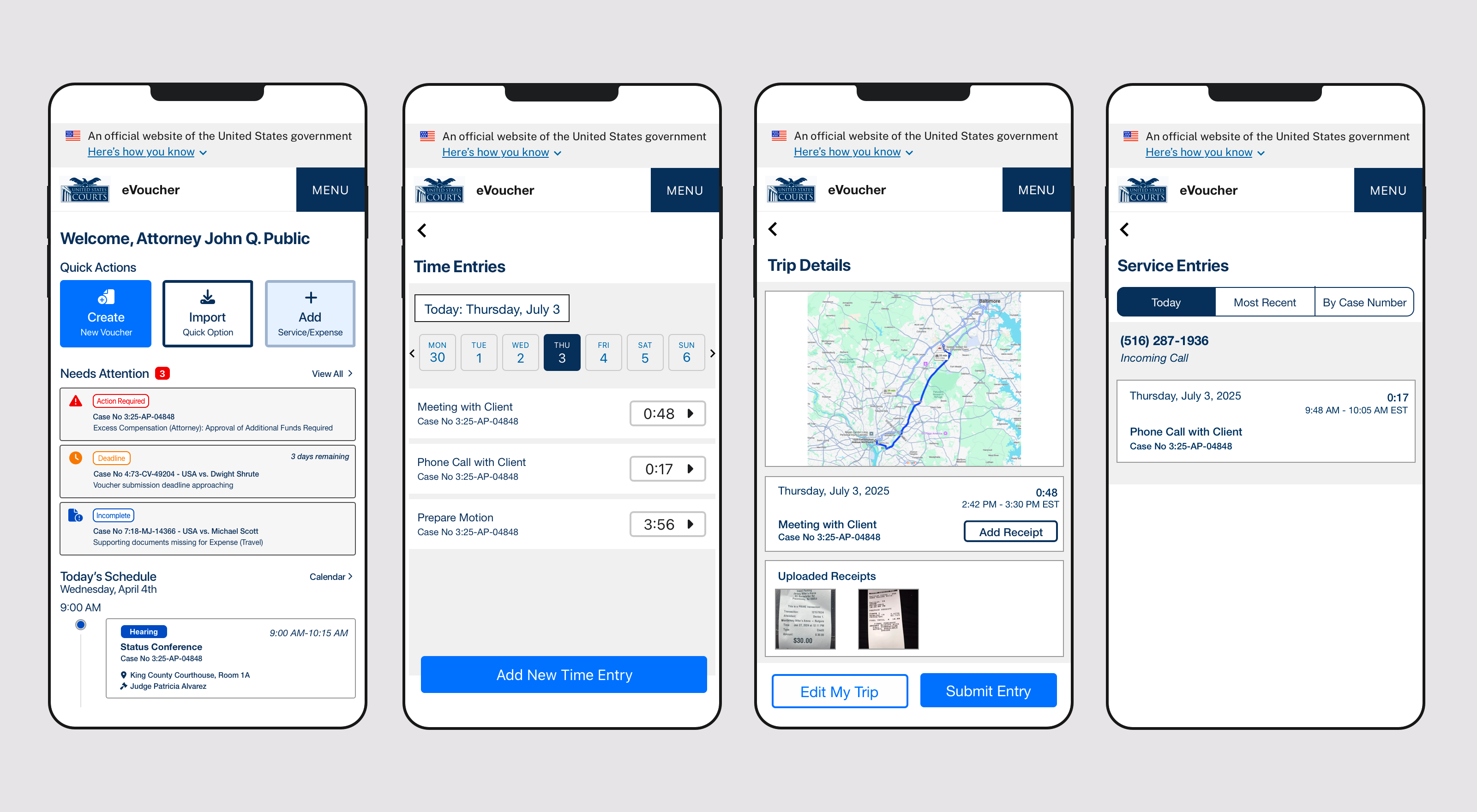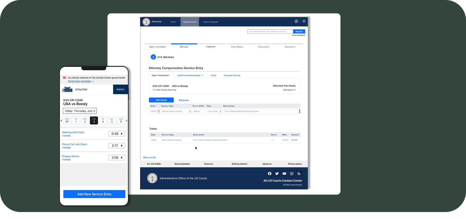
United States Courts were preparing to launch a new internal website and mobile app for attorneys appointed to represent individuals who cannot afford private representation. When an attorney is appointed to a case, they must invoice their work in order to get paid for their services. This website and mobile app help modernized an aging system that had become too clunky and difficult to use with modern trends where most people use smartphones to complement their work productivity. The challenge: launch a new, modernized version of the old system after capturing users' needs and addressing functionality and technological gaps in current workstreams.
This started out as a project to help the US Courts launch a website only, but during the initial Research and Discovery phases, it became evident that most users would benefit from a mobile app to capture data. As a UX Design Lead, I designed and launched the MVP process and stood up JIRA and other software development resources, led the mobile app effort with the Federal Lead, and modernized the entire application.
United States Courts (Supreme Court, District, Appellate, and Bankruptcy)
Washington, DC, United States
UX Design Lead, Information Architect
I worked closely with Jill for six months modernizing a case management system for federal judiciary. We were dealing with a legacy system that had grown organically over years, and Jill came in and established clear design standards that brought order to the chaos. She partnered with our BA team to make both teams so much more efficient, ensuring that everything we built was fully Section 508 compliant from day one. She turned compliance into something tangible that everyone could understand and apply. Jill was also great at managing stakeholder relationships, mentoring people across our teams, and bringing strategic vision that elevated our whole product design. Any organization building accessible, user-centered products would be lucky to have Jill on their team.

With the Courts preparing to launch by a specific deadline, my first challenge was designing the MVP and getting it ready for launch.
I started with discovery to understand the team's vision and the plans they had for the application. Court cases and attorney involvement are very complex by nature and for that reason getting alignment before starting any design work was crucial. To tackle this complexity, we decided to focus only on a specific piece of the application and not try to tackle all aspects of a case or voucher. This focused scope allowed us to launch faster while solving the most intimidating functional task that the application needs to accomplish.
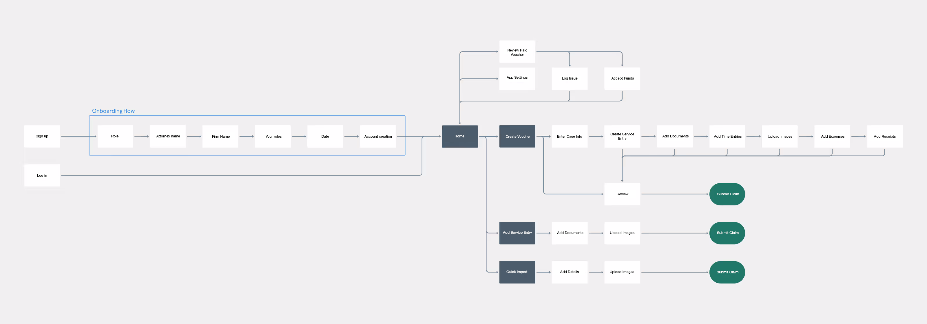
After we identified the key areas to focus on, I moved on to devising the app structure and what the user flows would look like for different user roles. These roles needed to have different levels of access to the tools and information within the app, requiring careful planning upfront. Aligning on these flows early with the team through flow charts helped us move faster and avoid having to rework parts of the app later on, which could be both costly and time-consuming.
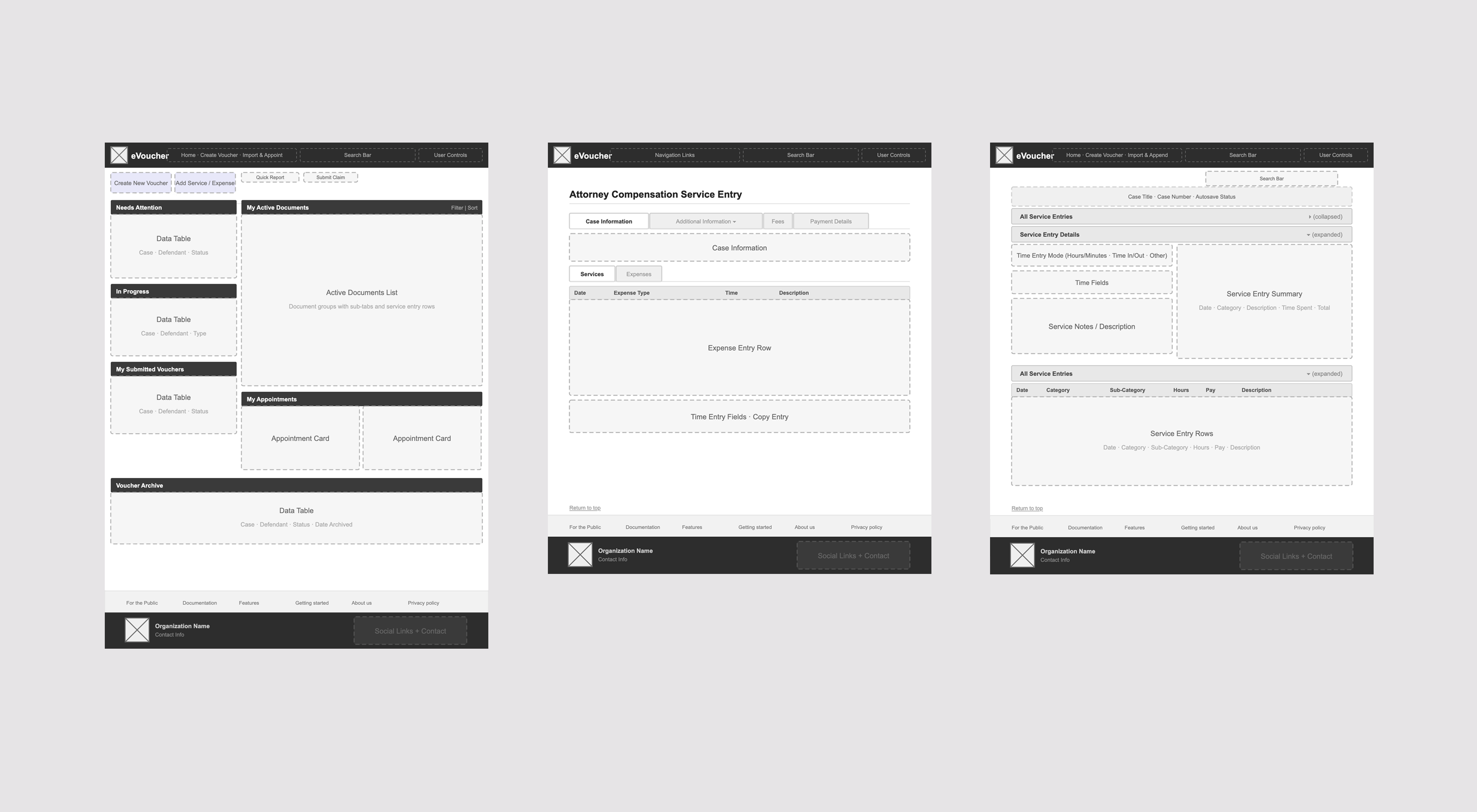
Once we had a structure in place, we moved on to low-fideelity wireframes where we explored how each screen would be laid out. This allowed us to quickly sketch out different user flows without having to spend too much time thinking about visual design details.
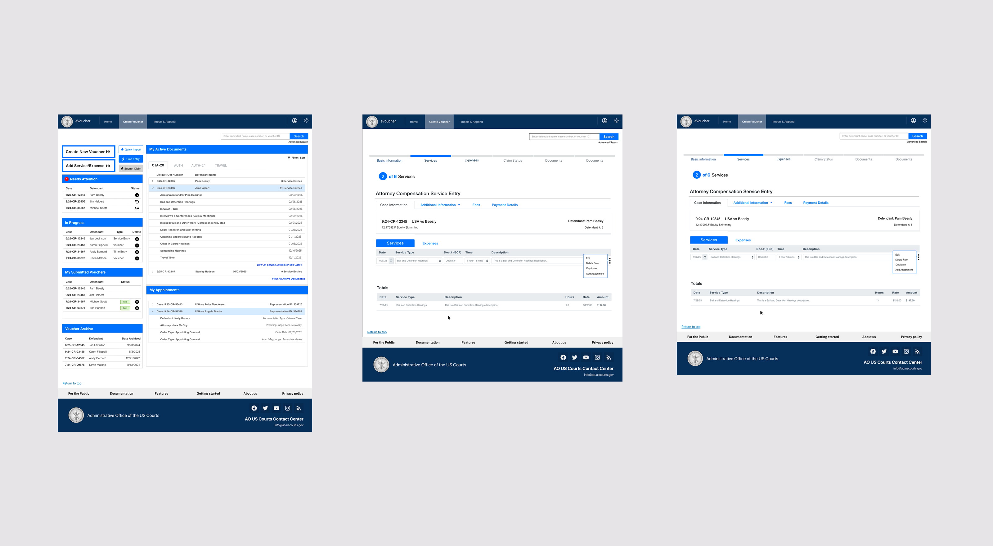
The main focus during the initial stages was onboarding and the service entry pieces - the main functionality within the eVoucher app - made to help attorneys streamline their reporting. This laid the foundation for further expansion and paved the way for introducing additional tools and features.
With the low-fidelity wireframes approved, I moved to UI design, creating development-ready mockups. This included defining the app's visual identity (typography, colors, buttons, component library) that aligned with the guidelines our team developed while following both USWDS and WCAG 2.2 standards. I made sure to design for the nature of legal paperwork and recordkeeping, opting for interfaces that are easily readable and offer calm and appealing visuals. The result was a cohesive UI that developers could implement efficiently.
To maintain consistency and lay the groundwork for future expansion into other court applications, we started working on a design system. In order for its implementation to be successful, all teams associated with this project had to be on board, so I worked on this effort alongside another UI Designer, and we coordinated the effort with the product manager and the developers.
This design system became the foundation for the team to create the UI rapidly, reducing design and development time for new features while ensuring brand consistency across all touchpoints. It accomplished this by being a single source of truth for brand assets and Section 508-accessible standardized UI components. For government applications, this is imperative to ensure adherence to contract deliverable timelines and budgetary constraints.
After the successful launch of the eVoucher app, it was time to expand to other features. The next logical step was to expand the capabilities of the mobile app, so I was tasked with designing the additional capabilities for the mobile uploads. This tool wasn’t supposed to be a part of the original eVoucher mobile app, but the users had shifted from initial use cases using the desktop application in 2010 to currently using their mobile devices heavily during travel and visiting clients. So we decided to create tools that lived inside the mobile app to support those use cases.